Tuesday 20 April 2010

Progression From Preliminary Task

My construction skills have developed quite a lot throughout the process of creating my magazine, when making my Preliminary magazine I struggled to create a good, neat structure for the front cover and contents page. This was due to a lack of knowledge on music magazines, which I've now gained through the different deconstructions of magazines. I also had a lack of experience in InDesign, so didn't use margins to allign everything neatly, unlike in my final copies of music magazine pages, when I knew techniques in Indesign that allowed me to create a neater structure. When creating my preliminary magazine pages, I also had a lack of experience on Photoshop, and couldn't change the background, to a colour of my preference; unlike when I was creating the pages for my music magazine when I knew how to change the background colour, which created a more professional image that was easy to create a colour scheme with. The Preliminary task did allow me to become more familiar with Photoshop tools, such as the anti-blemish tool, the burn and dodge tools, as well as the colour tools. This meant I found it easier to edit my images for my music magazine in Photoshop, and my Photoshop skills simply developed even further.

My ability to deconstruct music magazines has also developed a lot, I now know typical conventions of music magazines that feature on the front cover, double page spread and contents page. By recognising these conventions I was able to use them in my magazine pages to make them look more professional and realistic. At first it was difficult to deconstruct music magazine pages, because I was unaware of how different features such as colour scheme, image and font were all combined to create a specific style. However my ability to deconstruct became better and better, and I'm now more confident on how to identify the different features and explain their uses. due to deconstructing a number of different music magazine pages from NME, Q etc, I found it easier to deconstruct my final magazine pages on my blog. Showing how my skills had definitely developed over time.

My ability to analyse has also developed, when analysing my preliminary magazine page, I lacked the ability to give full explanations after reasoning and making statements. However, I now feel more confident when analysing my work, as I'm more aware of literary techniques in relation to media analysis, and what specific features should be analysed. Since I now know more about music magazines and their conventions, I'm also more aware of non conventional features which can be talked about during analysis. I've also become more fluent when analysing, and my analytical speech uses words such as juxtaposition, masthead, representation and symbolism. Making my analysis sound alot more professional and intellectual.


Friday 16 April 2010

Technology: Challanges, new skills and progression


Whilst creating my magazine I've learnt a lot about different computer programmes which I'd never used before, or had little experience using. I used In Design for the first time, and learnt how to create and edit different documents, as I used InDesign to publish all the pages for my magazine. I had little experience using Photoshop before, so I did face some difficulties sometimes. I hadn't done a photo shoot before either, but felt I adapted fairly quickly to the situation, and found this to be the most enjoyable technical process. Creating a blog, was fairly confusing at first, considering I'd never used a blog before, but this process was also fairly easy to adapt to, and I didn't face many difficulties.
When using InDesign, at first I struggled with some concepts, for example loading pictures into the document; as I was used to just copying and pasting images, but I learnt that the best way to load images in InDesign was to go to 'File', then 'Place', and then adjust the way the image fitted by going to 'Fitting' and choosing the best option. This was one of the more confusing parts of InDesign at first. InDesign was a lot different to any other programmes I'd used previously, as it was similar to the Microsoft Word programme, but came with a lot more technical advantages, that allowed you edit your documents to a higher standard. So at times I struggles with it, simply because there were a lot more tool options in relation to editing features, and I had to adapt to learning what all these new tools were and what they allowed me to do.
Photoshop was confusing at times because I wasn't use to using it, and the variety of tools was often complicating. I enjoyed the different aspects of Photoshop that allowed me to; eliminate blemishes, lighten and darken my models features, change the colour of clothing/eyes/hair, and apply 'make-up' onto my models. I hadn't been able to do this on any other photo editing computer programmes, which made Photoshop become extremely useful in getting the best quality images for my magazine pages. I feel that I now am more familiar with Photoshop, and know how to edit my images to my preference because I'm more aware of how to use the different tools.
When preparing for the photo shoot, one of the most difficult tasks was choosing a look for my model, that was suitable for my target audience, as well as standing out among other images.
Therefore I did a lot of preparation before the photo shoot such as sketches and research on other music artists, to help create the right look. The photo shoot itself wasn't as challenging, as the research meant I knew what type of poses and facial expressions I wanted my model to achieve. From this task I now understand how to make a photo shoot successful; by doing enough preparation in relation to poses, make-up and costume, so when doing the photo shoot itself, you have a good direction and understanding of what needs doing.
From the blog, I've learnt how to support my analysis by using images from my scrapbook as support, and how to scan images onto the computer so I can place them onto my blog;. I wasn't aware of how to do this before I started using the blog, and I'm glad I have this new skill.


Attracting The Target Audience


The questionnaire and pie chart data helped me to realised what my target audience found attractive, which is why I sculpted features such as; the models gender, colour schemes, featuring music genres, around these results. This worked because I gave out my questionnaire to people who fitted into my target audience profile.
The intended audience would be attracted to my magazine through use of a structured colour scheme, that varies throughout the double page spread, contents page and front cover. Although the colours vary, I still use a lot of pinks, turquoise, black and purple, so there are some similarities in the different pages.


The results from my questionnaire voted these colours to be among the most popular to include in my magazines pages, however unfortunately I didn't make a pie chart with these results.
I also included a mixture of images; the images of my model were more artistic and interesting, whereas a lot my images in the contents page were of smiley and happy females, and one with a musical male, to add some variety. When doing my questionnaire, results showed that female models were the most popular to use, therefore I used mostly female models in the images.

The variety of images in intended to attract teh range of girls within the age group 15-19, which I intended to do.

Thursday 15 April 2010

My Target Audience


My aim was to attract a female audience aged from 15-19 years of age, who were interested in a range of music types, as well as; fashion, celebrities and music related T.V shows. In order to attract my target audience I created a questionnaire and handed it out to 20 different people to complete. Since I was looking to attract mainly a female audience, I handed it out to mostly girls (18 girls) and a minimal amount of males (2 males). This way I could collect information from the people who fitted in to my target audience, as well as a couple of people outside of my target audience. I wanted to attract this type of audience because it's in my age group, so I felt I could relate to what this type of audience would find attractive in a music magazine; this is why included a couple of articles related to subjects such as fashion, because I felt that this would enforce more dimensions to the magazine, which I could also relate to music, this way I wouldn't be going off task and would still creating a music magazine.


Above is a copy of my mood board, scanned in from my scrapbook. I found the mood board useful to look back on and remind myself what type of audience I'm looking to attract. I made the mood board feminine, by using the colour pink and using images with mostly females in them. I used images of clothing such as shoes, jewellery and bags to symbolise fashion aspects of my magazine as well to represent the females target audience. I used a picture of a train to symbolise that my magazine would be British and the intended audience would be British citizens, and would be average, middle class UK citizens.


This is the questionnaire I made for my audience to complete.


To accompany my questionnaire, I made pie charts using the results of some of the questions, I did this using Microsoft Excel, after creating the pie charts I copied and pasted them in to a word document, so I could print them off and place them in to my scrapbook.
I used the information from the questionnaire and the pie chart data to determine particular aspects of my magazine; using a female model on the front cover, deciding what genres of music to feature, and the colour scheme.

Wednesday 14 April 2010

Media Institutions And Magazine Distribution

Magazine publisher 'Bauermedia' would be most suited to publishing my magazine because it already produces a good range of magazines, and the publishers seem interested in music considering they work with Q magazine, and popular radio stations such as 'Kiss' and 'Kerrang!' Although Bauermedia works with a lot of music related media sources, they don't publish a magazine like mine, which aims to target females aged 15-19, who are interested in music, as well as other topics such as fashion and celebrities. As most female targeted magazines they sell are based on just fashion, or celebrities. Therefore, Bauermedia would benefit from the new audience my magazine would attract, who's main interest in my magazine would be the music, but they'd also read some features on celebrities and fashion.
Retail shops WHSmiths and HMV would sell my magazine, as it's then sold towards a mass audience, which is suitable considering it's three main topics (music, fashion and celebrities) are all widely popular. Shops like Sainsburys, Tescos and Waitrose would also sell my magazine; this is because these shops are some of the most used in England and my magazine would therefore attract a really wide audience. My magazine will have an overall readership of 130,179 across England and a circulation figure of 40, 978. A majority of this figure (89%) will be female, with little male interest, at an average age 0f 17. Most of this audience will be studying still, with some working part time and some working full time. This fits in with the target audience I had in mind.
Online features such as a website dedicated would assist my magazine, as this way readers can visit the site to find out more information on my magazines aims, upcoming/past features, details in relation to price and when it's published. I would also use advertisements on my website for the different features on the next weeks magazine, as well as for features on the current magazine; this would hopefully attract people who hadn't purchased the magazine before, to buy a copy. I would post these advertisements on social networking sites like Facebook and Myspace, because a lot of people within my target audience use these sights, as well as people outside of my target audience, and my magazine would receive a larger range of interest.
I would create a fan page on Facebook for my magazine, as this would act as another advertising technique.

Tuesday 13 April 2010

Double Page Spread: Final Copy

This is my final copy of the double page spread for my magazine:

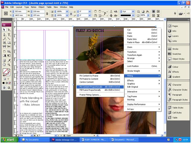
My double page spread represents a happy and conversational characterisation of the music artist in the text, the questions are related to music, as well as other topics such as her love life and future, and link to fashion and her fan base; questions include 'What do you look for in a man?' and 'Would you ever consider producing your own fashion line'. Causing my magazine to seem as though it's upbeat and friendly, which suits the intended, teenage female audience. Language such as 'nations hottest solo artist', 'Indie fashionista' and 'idolised by thousands of teenage girls', are used to advertise the content within the double page spread, and make the text appear more mainstream by talking about the attractive features and popularity of the artist. This cheery vibe is also expressed through the choice of colours, which are mostly vibrant; blue, red, purple and green. This symbolises liveliness and happiness, which is meant to be projected by the double page spread, to make it appealing. The close up image, is also quite vibrant, due to the make up colour choices, this symbolises the models quirky look, but also symbolises the type of artists my magazine values; people with vibrant and quirky personalities who would appeal to a female audience.
Different social groups could easily be attracted to this double page spread; the flowers in the models hair symbolise nature and individuality, the colourful make up also symbolises uniqueness and quirkiness. Whereas the topics discussed in the interview are more feminine (for example would you ever consider producing your own fashion line?'). Girls who were perhaps more fashionable, quirky or offbeat would be attracted to the double page spread because of the image, and they'd be drawn to finding out more on this musician who'd they would perhaps find easily relate able. More feminine girls may be drawn to the double page spread because the topic is quite ranged, but focuses mainly on feminine topics such as the featuring artists love life.
I tried not to conformed to some stereotypes in relation to typical music magazine structure conventions; a lot of music magazines chose layouts with one page of text and the other page dedicated to one or more images for their double page spread. Music magazines also type the date, page number and magazine title as a footer at the bottom of the page, and using the musicians name in the heading, in the same way I did. I conformed to these stereotyped conventions because I wanted the double page spread to be recognised that it'd feature in a music magazine, and didn't look randomly structured and un-organised. But I create my double page spread to look stereotypically feminine, by using only pinks and purples, and having feminine decorations such as love heart shapes, and images of pretty and smiley girls, with model inspired hair and make up. Instead i opted for my model to have a more unique look, which could appeal to a range of girls, including very feminine girls. By using phrases such as 'hottest solo artist' and 'she's idolised', I created the illusion that the artist had a hugely successful career and was popular among a wide audience in the UK. This character profile is stereotypical the characterisation of most music artists who feature in music magazines, as they are usually always mainstream and obviously successful.

Contents Page: Final Copy

This is my final copy of my contents page for my magazine:


My contents page shows an ideology that music and fashion are large aspects of modern life, and important features in entertainment and media; especially media publishments such as magazines. My contents page achieves this by using features in relation to only fashion, music and the music related T.V shows, the X-Factor. Using features with little variety, creates a large and in depth focus on closely related subjects, which I think, highlights their importance, as the whole magazine is dedicated to these subjects.
My contents page wouldn't attract a very large range of different social groups, but would appeal mainly to my target audience of females aged 15-19. This is achieved through the pink, purple and black colour scheme, which is quite feminine. The fonts I have used aren't as feminine, but more artistic and quirky. This would probably attract more individual girls, who perhaps are outside the social group of very feminine girls. This is the type of range I wanted to achieve, although my magazine is aimed at particular age group and sex, I want the variety of people in this social category to be attracted to my magazine. The images are quite mixed, I've used male and female models to create a variety. The poses vary, some are serious, others are more experimental and some look happy and cheery. The image on the model I also used on the front cover, has an temperamental look to her that juxtaposes against the happy and smiling pose used by my model in the image which is second down from the top of the page. A difference in poses makes it seem as though my magazine uses models with varying personalities, which could be suited to people from different social groups and varying personalities.
The contents page doesn't conform to any stereotypes, although it looks feminine through using purple and pink, the black and yellow isn't as gender specific, so therefore could appeal to females who aren't stereotypically feminine, as well as some males too perhaps. The features used are based on music an fashion, which does conform more to stereotypical female music magazines, but I needed to conform to this so that teh magazine could appeal to my female target audience.

Front Cover: Final Copy

This is my final product of a front cover for my magazine:


My front cover has the same ideology as my contents page, it focuses on music and fashion and health which make these topics seem important and popular in modern society, and for media focus. I even have a feature on health, which talks about diet and exercise, which is another important concept in modern society, and a lot of girls follow healthy lifestyles to do with diet and exercise.
My front cover can be seen as appealing by a range of different social groups, however these social groups are all likely to come under my target audience, or close to the age group of 15-19. The colour scheme of mostly pink, turquoise, black and yellow, with a white background, has created a feminine style, but avoids looking overly feminine. The colours turquoise and black are stereotypically seen as more masculine, but combined with white and pink, they become a lot softer. Meaning that a range of girls who varied from having very feminine, to not feminine taste in merchandise, could be attracted to my magazine, via the front cover. The masthead font I've used has a very modern design, and would appeal to the younger generation, who are part of my target audience, as I'm not intending to attract people aged 20+ to my magazine; although they might find the modern font appealing. By creating a quirky look, by using experimental make up on my model, my magazine looks more offbeat and artistic, this would probably attract teenage girls with a less feminine, quirky style; however the text mentioning fashion articles may attract stereotypical feminine girls who are interested in fashion.
I conformed to the stereotype that magazines aimed at a female audience often have articles to do with fashion, and dieting; I've also used pink in the colour scheme which is a stereotypically feminine colour. However, I found this to be necessary in order to attract my target audience. I strayed away from the stereotypical main image on front covers aimed at females; which are usually happy, smiling girls, or topless boys. I didn't' wanted my image to symbolise someone with individuality, with a look that wasn't stereotypically feminine, so that a range of girls from different social groups would find it appealing.

Monday 12 April 2010

Double Page Spread Analysis

When constructing my double page spread, I found the magazine Q most helpful because their structures were well presented and sophisticated. I chose a feature from Q magazine on the band N-Dubz as a basis for the structure of my double page spread. I liked the way border lines had been used to outline the headings, as I used similar border lines for my contents page, and felt this would create a nice pattern in the contents page and double page spread. I also liked the use of one large image on one page and text on the other. This way I could show off my photography by having one large, good quality image. I tried to match the font colours to similar colours used on my models make up and accessories to create a well structured pattern.


I used margins on the screen to make sure I had a structured alignment for my text box's, which suited the structural, sophisticated style I wanted to create with my double page spread. I ensured I un-ticked the 'Hyphenate' box at the top of the screen, so that the wording was more attractive and looked more professional.


When placing my image into InDesign, I went to 'File' the clicked 'Place', and once the image was loaded into the InDesign document I clicked 'Object' and then 'Fitting' and selected 'Fit Content Proportionally'. I filled up a whole page with this image, because the structure looked simple, but the use of an image meant the reader wouldn't be overwhelmed by too much text, and the close up image was quite captivating, and appealing for the reader.


When changing the fonts I simply clicked on the font drop down button on the tool box at the top of the page. When selecting a fonts, I chose one which wasn't overly sophisticated, but instead one which was simple, but quite feminine, so would be appealing for my target audience of girls aged 15-19.


I placed a quotation from the text in the middle of the text because it's done in a lot of music magazines such as NME and Q, and I wanted to use this music magazine convention to make my double page spread look realistic. I made the text for this quotation slightly bolder and in a larger font so it would stand out.


I added extra margins horizontally on the top and the bottom of the text box to ensure the alignments were even, and the structured look I was aiming for was there. I did this by going to the lined and numbered measurements line, placed below the tool box. I simply clicked on this, then dragged the mouse down to were I wanted to place the margin, and it appeared where I wanted it to.


I used the margins which I placed either side of the text box and an alignment to where I could place border lines for decoration, I did this by clicking on the shapes tool, placed on the left hand side text box. After drawing the rectangle in alignment with the margin, I changed the width and colour so they matched. I went through the same process to create the vertical border lines next to the heading.


Contents Page Analysis


When creating my contents page I based some of the structure on an NME contents page, which has a really well structured style and good colour code; I also really liked the way the different text was set separately and the use of shapes with text in them. When I was deconstructing magazine contents pages in my scrapbook I saw a lot of common conventions used such as the date, name of the magazine and listing of different features. I therefore used these on my contents page in order to make it look more like an actual music magazine front cover. I found NME magazine particularly useful when creating my music magazine because it's created a lot of interesting quirky contents pages, which still have a good structure and colour code.


When creating my contents page, I used the shape tool and selected a rectangle, I placed these rectangles in structured positions using the margins to make sure they were placed evenly on the page, then chose a colour for them. I placed small border lines in the box on the left hand side of the page, in order to separate the different text, and also for decorative purposes. I did this using the line tool, then went to the toolbox at the top of the page to change the width and length of the line.


The margin lines were really helpful to make sure the different texts and images were aligned correctly.
I placed the name of my magazine and the date of it's release in the box at the top of the contents page; as it follows the conventions of most music magazines, which include the date and magazine title in their contents page. I used a circle beside this text box, by using the shape tool. I then placed a text box within it and rotated it clockwise, using the box at the top of the InDesign document.


Using the margins, I composed borders in the empty spaces, as a way of separating text and for decorative purposes as well. I created these borders using the line tool to draw them on, then adjusted their width and length using the box at the top of the InDesign document, where the measurements able to be adjusted.
I placed text boxes between these borders, so I could write between them.


I used the shapes tool with a text box in it to create a voucher for my contents page. I wanted to use this idea, because I think it fits in with music magazine conventions, makes the contents page more audience inclusive, an is also a good decoration technique.


One of the final stages when creating my contents page, was importing the images. To do this I made a box using the box tool, went to 'file' and clicked 'place', and selected my image. I then went to 'fitting' and clicked 'fit to contents to frame'. This way my image was the same size as the box it was placed in. I repeated the following steps again when placing my other images into the contents page.


Teacher feedback suggested that i made changes to the voucher at the bottom of the contents page, and I changed it's colour as well as the text on it, to make it more appealing to the audience. The feedback also suggested that I changed the column on the left hand side by adding more images to it, so i took more pictures which were suitable for the contents page.

Front Cover Analysis

I started generating ideas for my front cover through work for my scrapbook, such as; creating a mood board which helped my set a theme and style, looking through my questionnaire results which had specific ideal isms set by my target audience, and by deconstructing other magazine front covers, which helped me to see different styles of layouts and colour coding. I found the music magazines The Rolling Stone, Q and NME helpful when I was working towards my front cover, because I liked their layout styles, and how they managed to create a specific genre which was visible through their front covers.


I started creating my front cover on the computer by selecting my chosen image and importing it into Photoshop. Using the quick selection tool I then cut out the background behind my model so it was white. When editing my model in Photoshop I didn't make many changes to her because I felt I'd made her stand out enough in the photo shoot by using quirky make up and accessories. So I just used the blemish tool to even out her skin, and used the dodge tool to whiten her teeth. Teacher feedback suggested that my image didn't need much editing and that a white background was suitable because the image was quite striking, so a plain background would help to emphasis this. I used a female model with a fairly indie/bohemian look because my questionnaire results showed a clear preference for a female model. The results also showed a preference for Indie music, and musical artists such as Florence and the machine. Florence has quite a quirky and unique look, which is what I tried to create for my model.


I used InDesign to create my front cover, I tried to use a minimal amount of different colours and fonts in order to keep a simple and structured style for my magazine. I used shapes with text in them to make my magazine more aesthetically interesting. To do this i went to the shapes tool and selected a circle for the top left and a then a square for the bottom right. I coloured these two shapes the same shade of blue, and used similar font colours for both of them as well, as well as the same font. For the square on the bottom left I only showed half of it on the front cover page, so it showed up as a triangle in the corner. I got this idea front The Rolling Stone- Britney Spears front cover, which I contructed.


I filled a lot of the blank spaced beside the images with text so it didn't look empty. For the text on the bottom right, I slanted the text box so that it fitted in the empty space, and looked more interesting than straight lined text. I also slanted the text box which I placed in the triangle in the bottom left corner, so that the text followed the same lines and shape as the triangle. Most of the font colours I used were the same, except for the text on the bottom right hand corner, were I used some red. This was to draw more attention to this text, because it was advertising my special feature of the magazine.


I used the colour tool to make sure I used matching colours, when I wanted to use the same colour again I made sure the numbers on the colour chart were the same, so that I got the exact same colour. This helped me to create a colour code that structured my front covers look. I used mostly yellow, blue, black, white and pink. All of these colours matched up to the colours of the accessories and make up on my model. The colours are mostly feminine when combined together, but they're not overwhelmingly feminine so can attract a variety of girls. The colours are vibrant and youthful which suits my target audience of girls aged 15-19.
Feed back from questionnaire helped me to create this colour scheme, as the people I asked had a similar colour preference of blues, pinks and golds, which I used in my front cover.