One of the front covers I deconstructed was of the Q music magazine, April 2009 front cover of Lily Allen. One of the reasons I chose this specific front cover is because of the sybolism behind the image. The use of panthers, dressign Lily all Black, with her back showing all releates to sensuality and animals, and purposely displays Lily as a sexy, animalistic character. I liked the way she was shown to be characterised differently, and wanted to use the idea of doing something symbolic with my model. I also like the structural arrangement of the front cover; the way the title was placed 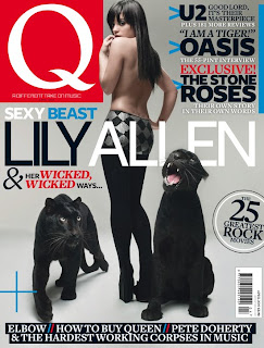 across the image, the placement of text in the two top corners and bottom of the magazine, giving the front cover a well structured and appealing look.
 across the image, the placement of text in the two top corners and bottom of the magazine, giving the front cover a well structured and appealing look.
 The typography was also very impressive, the variety between font sizes, and bold, italics, ect. This variety was even included in blocks of text, and the mixture genuinely looked very appealing overall. I felt that if I could find a way of varying my fonts in a way that looked good, similarly to this, then I would try to do so.
The colour coding in this specific front cover was very appealing, the mixture of black, blue, white and red mixed together really well, without looking over complicated, and instead look artistic and interesting. These coloured fonts mixed in with the sexy image of Lily Allen connected togther to make the front cover appealing to the specific target audiece of youngish male men. I wanted to use style these features in my magazine to attract my target audience.
 The other front cover I deconstructed was of the Rolling Stone music magazine, with Britney Spears on the front cover. The reason I chose this particular front cover is because I like the black and white, close up image. It was of Britney back in her early days as a popstar, and this edition of the magazine was published shortly after Britneys public breakdown. The symbolism behind the image gave the front cover more of an edge, and made it more appealing.
 The fonts were all the same, and either yellow, white or black, which made an attractive colour scheme that could appeal to both genders, which suited the magazine which aims to appeal to both genders.
No comments:
Post a Comment