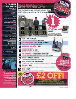
When creating my contents page I based some of the structure on an NME contents page, which has a really well structured style and good colour code; I also really liked the way the different text was set separately and the use of shapes with text in them. When I was deconstructing magazine contents pages in my scrapbook I saw a lot of common conventions used such as the date, name of the magazine and listing of different features. I therefore used these on my contents page in order to make it look more like an actual music magazine front cover. I found NME magazine particularly useful when creating my music magazine because it's created a lot of interesting quirky contents pages, which still have a good structure and colour code.
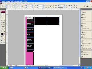
When creating my contents page, I used the shape tool and selected a rectangle, I placed these rectangles in structured positions using the margins to make sure they were placed evenly on the page, then chose a colour for them. I placed small border lines in the box on the left hand side of the page, in order to separate the different text, and also for decorative purposes. I did this using the line tool, then went to the toolbox at the top of the page to change the width and length of the line.
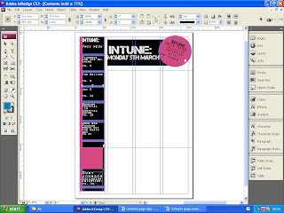
The margin lines were really helpful to make sure the different texts and images were aligned correctly.
I placed the name of my magazine and the date of it's release in the box at the top of the contents page; as it follows the conventions of most music magazines, which include the date and magazine title in their contents page. I used a circle beside this text box, by using the shape tool. I then placed a text box within it and rotated it clockwise, using the box at the top of the InDesign document.
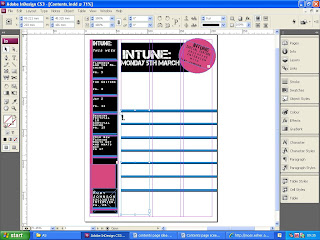
Using the margins, I composed borders in the empty spaces, as a way of separating text and for decorative purposes as well. I created these borders using the line tool to draw them on, then adjusted their width and length using the box at the top of the InDesign document, where the measurements able to be adjusted.
I placed text boxes between these borders, so I could write between them.
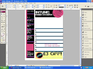
I used the shapes tool with a text box in it to create a voucher for my contents page. I wanted to use this idea, because I think it fits in with music magazine conventions, makes the contents page more audience inclusive, an is also a good decoration technique.
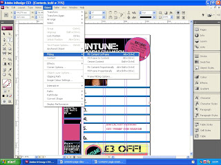
One of the final stages when creating my contents page, was importing the images. To do this I made a box using the box tool, went to 'file' and clicked 'place', and selected my image. I then went to 'fitting' and clicked 'fit to contents to frame'. This way my image was the same size as the box it was placed in. I repeated the following steps again when placing my other images into the contents page.
Teacher feedback suggested that i made changes to the voucher at the bottom of the contents page, and I changed it's colour as well as the text on it, to make it more appealing to the audience. The feedback also suggested that I changed the column on the left hand side by adding more images to it, so i took more pictures which were suitable for the contents page.
No comments:
Post a Comment