
I started creating my front cover on the computer by selecting my chosen image and importing it into Photoshop. Using the quick selection tool I then cut out the background behind my model so it was white. When editing my model in Photoshop I didn't make many changes to her because I felt I'd made her stand out enough in the photo shoot by using quirky make up and accessories. So I just used the blemish tool to even out her skin, and used the dodge tool to whiten her teeth. Teacher feedback suggested that my image didn't need much editing and that a white background was suitable because the image was quite striking, so a plain background would help to emphasis this. I used a female model with a fairly indie/bohemian look because my questionnaire results showed a clear preference for a female model. The results also showed a preference for Indie music, and musical artists such as Florence and the machine. Florence has quite a quirky and unique look, which is what I tried to create for my model.
I used InDesign to create my front cover, I tried to use a minimal amount of different colours and fonts in order to keep a simple and structured style for my magazine. I used shapes with text in them to make my magazine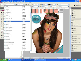 more aesthetically interesting. To do this i went to the shapes tool and selected a circle for the top left and a then a square for the bottom right. I coloured these two shapes the same shade of blue, and used similar font colours for both of them as well, as well as the same font. For the square on the bottom left I only showed half of it on the front cover page, so it showed up as a triangle in the corner. I got this idea front The Rolling Stone- Britney Spears front cover, which I contructed.
 more aesthetically interesting. To do this i went to the shapes tool and selected a circle for the top left and a then a square for the bottom right. I coloured these two shapes the same shade of blue, and used similar font colours for both of them as well, as well as the same font. For the square on the bottom left I only showed half of it on the front cover page, so it showed up as a triangle in the corner. I got this idea front The Rolling Stone- Britney Spears front cover, which I contructed.
I filled a lot of the blank spaced beside the images with text so it didn't look empty. For the text on the bottom right, I slanted the text box so that it fitted in the empty space, and looked more interesting than straight lined text. I also slanted the text box which I placed in the triangle in the bottom left corner, so that the text followed the same lines and shape as the triangle. Most of the font colours I used were the same, except for the text on the bottom right hand corner, were I used some red. This was to draw more attention to this text, because it was advertising my special feature of the magazine.

I used the colour tool to make sure I used matching colours, when I wanted to use the same colour again I made sure the numbers on the colour chart were the same, so that I got the exact same colour. This helped me to create a colour code that structured my front covers look. I used mostly yellow, blue, black, white and pink. All of these colours matched up to the colours of the accessories and make up on my model. The colours are mostly feminine when combined together, but they're not overwhelmingly feminine so can attract a variety of girls. The colours are vibrant and youthful which suits my target audience of girls aged 15-19.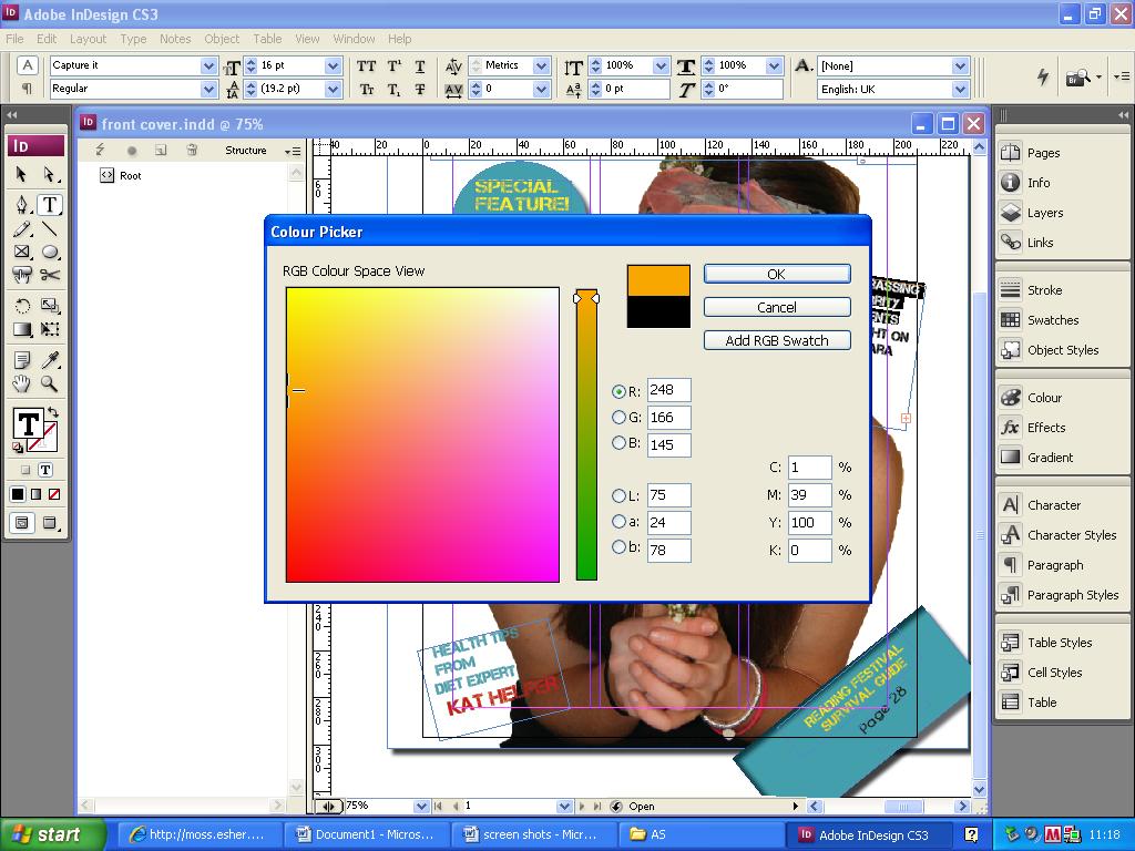

Feed back from questionnaire helped me to create this colour scheme, as the people I asked had a similar colour preference of blues, pinks and golds, which I used in my front cover.
No comments:
Post a Comment