Tuesday, 13 April 2010

Front Cover: Final Copy

This is my final product of a front cover for my magazine:


My front cover has the same ideology as my contents page, it focuses on music and fashion and health which make these topics seem important and popular in modern society, and for media focus. I even have a feature on health, which talks about diet and exercise, which is another important concept in modern society, and a lot of girls follow healthy lifestyles to do with diet and exercise.
My front cover can be seen as appealing by a range of different social groups, however these social groups are all likely to come under my target audience, or close to the age group of 15-19. The colour scheme of mostly pink, turquoise, black and yellow, with a white background, has created a feminine style, but avoids looking overly feminine. The colours turquoise and black are stereotypically seen as more masculine, but combined with white and pink, they become a lot softer. Meaning that a range of girls who varied from having very feminine, to not feminine taste in merchandise, could be attracted to my magazine, via the front cover. The masthead font I've used has a very modern design, and would appeal to the younger generation, who are part of my target audience, as I'm not intending to attract people aged 20+ to my magazine; although they might find the modern font appealing. By creating a quirky look, by using experimental make up on my model, my magazine looks more offbeat and artistic, this would probably attract teenage girls with a less feminine, quirky style; however the text mentioning fashion articles may attract stereotypical feminine girls who are interested in fashion.
I conformed to the stereotype that magazines aimed at a female audience often have articles to do with fashion, and dieting; I've also used pink in the colour scheme which is a stereotypically feminine colour. However, I found this to be necessary in order to attract my target audience. I strayed away from the stereotypical main image on front covers aimed at females; which are usually happy, smiling girls, or topless boys. I didn't' wanted my image to symbolise someone with individuality, with a look that wasn't stereotypically feminine, so that a range of girls from different social groups would find it appealing.

Monday, 12 April 2010

Double Page Spread Analysis

When constructing my double page spread, I found the magazine Q most helpful because their structures were well presented and sophisticated. I chose a feature from Q magazine on the band N-Dubz as a basis for the structure of my double page spread. I liked the way border lines had been used to outline the headings, as I used similar border lines for my contents page, and felt this would create a nice pattern in the contents page and double page spread. I also liked the use of one large image on one page and text on the other. This way I could show off my photography by having one large, good quality image. I tried to match the font colours to similar colours used on my models make up and accessories to create a well structured pattern.


I used margins on the screen to make sure I had a structured alignment for my text box's, which suited the structural, sophisticated style I wanted to create with my double page spread. I ensured I un-ticked the 'Hyphenate' box at the top of the screen, so that the wording was more attractive and looked more professional.


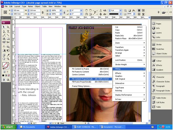
When placing my image into InDesign, I went to 'File' the clicked 'Place', and once the image was loaded into the InDesign document I clicked 'Object' and then 'Fitting' and selected 'Fit Content Proportionally'. I filled up a whole page with this image, because the structure looked simple, but the use of an image meant the reader wouldn't be overwhelmed by too much text, and the close up image was quite captivating, and appealing for the reader.


When changing the fonts I simply clicked on the font drop down button on the tool box at the top of the page. When selecting a fonts, I chose one which wasn't overly sophisticated, but instead one which was simple, but quite feminine, so would be appealing for my target audience of girls aged 15-19.


I placed a quotation from the text in the middle of the text because it's done in a lot of music magazines such as NME and Q, and I wanted to use this music magazine convention to make my double page spread look realistic. I made the text for this quotation slightly bolder and in a larger font so it would stand out.


I added extra margins horizontally on the top and the bottom of the text box to ensure the alignments were even, and the structured look I was aiming for was there. I did this by going to the lined and numbered measurements line, placed below the tool box. I simply clicked on this, then dragged the mouse down to were I wanted to place the margin, and it appeared where I wanted it to.


I used the margins which I placed either side of the text box and an alignment to where I could place border lines for decoration, I did this by clicking on the shapes tool, placed on the left hand side text box. After drawing the rectangle in alignment with the margin, I changed the width and colour so they matched. I went through the same process to create the vertical border lines next to the heading.


Contents Page Analysis


When creating my contents page I based some of the structure on an NME contents page, which has a really well structured style and good colour code; I also really liked the way the different text was set separately and the use of shapes with text in them. When I was deconstructing magazine contents pages in my scrapbook I saw a lot of common conventions used such as the date, name of the magazine and listing of different features. I therefore used these on my contents page in order to make it look more like an actual music magazine front cover. I found NME magazine particularly useful when creating my music magazine because it's created a lot of interesting quirky contents pages, which still have a good structure and colour code.


When creating my contents page, I used the shape tool and selected a rectangle, I placed these rectangles in structured positions using the margins to make sure they were placed evenly on the page, then chose a colour for them. I placed small border lines in the box on the left hand side of the page, in order to separate the different text, and also for decorative purposes. I did this using the line tool, then went to the toolbox at the top of the page to change the width and length of the line.


The margin lines were really helpful to make sure the different texts and images were aligned correctly.
I placed the name of my magazine and the date of it's release in the box at the top of the contents page; as it follows the conventions of most music magazines, which include the date and magazine title in their contents page. I used a circle beside this text box, by using the shape tool. I then placed a text box within it and rotated it clockwise, using the box at the top of the InDesign document.


Using the margins, I composed borders in the empty spaces, as a way of separating text and for decorative purposes as well. I created these borders using the line tool to draw them on, then adjusted their width and length using the box at the top of the InDesign document, where the measurements able to be adjusted.
I placed text boxes between these borders, so I could write between them.


I used the shapes tool with a text box in it to create a voucher for my contents page. I wanted to use this idea, because I think it fits in with music magazine conventions, makes the contents page more audience inclusive, an is also a good decoration technique.


One of the final stages when creating my contents page, was importing the images. To do this I made a box using the box tool, went to 'file' and clicked 'place', and selected my image. I then went to 'fitting' and clicked 'fit to contents to frame'. This way my image was the same size as the box it was placed in. I repeated the following steps again when placing my other images into the contents page.


Teacher feedback suggested that i made changes to the voucher at the bottom of the contents page, and I changed it's colour as well as the text on it, to make it more appealing to the audience. The feedback also suggested that I changed the column on the left hand side by adding more images to it, so i took more pictures which were suitable for the contents page.

Front Cover Analysis

I started generating ideas for my front cover through work for my scrapbook, such as; creating a mood board which helped my set a theme and style, looking through my questionnaire results which had specific ideal isms set by my target audience, and by deconstructing other magazine front covers, which helped me to see different styles of layouts and colour coding. I found the music magazines The Rolling Stone, Q and NME helpful when I was working towards my front cover, because I liked their layout styles, and how they managed to create a specific genre which was visible through their front covers.


I started creating my front cover on the computer by selecting my chosen image and importing it into Photoshop. Using the quick selection tool I then cut out the background behind my model so it was white. When editing my model in Photoshop I didn't make many changes to her because I felt I'd made her stand out enough in the photo shoot by using quirky make up and accessories. So I just used the blemish tool to even out her skin, and used the dodge tool to whiten her teeth. Teacher feedback suggested that my image didn't need much editing and that a white background was suitable because the image was quite striking, so a plain background would help to emphasis this. I used a female model with a fairly indie/bohemian look because my questionnaire results showed a clear preference for a female model. The results also showed a preference for Indie music, and musical artists such as Florence and the machine. Florence has quite a quirky and unique look, which is what I tried to create for my model.


I used InDesign to create my front cover, I tried to use a minimal amount of different colours and fonts in order to keep a simple and structured style for my magazine. I used shapes with text in them to make my magazine more aesthetically interesting. To do this i went to the shapes tool and selected a circle for the top left and a then a square for the bottom right. I coloured these two shapes the same shade of blue, and used similar font colours for both of them as well, as well as the same font. For the square on the bottom left I only showed half of it on the front cover page, so it showed up as a triangle in the corner. I got this idea front The Rolling Stone- Britney Spears front cover, which I contructed.


I filled a lot of the blank spaced beside the images with text so it didn't look empty. For the text on the bottom right, I slanted the text box so that it fitted in the empty space, and looked more interesting than straight lined text. I also slanted the text box which I placed in the triangle in the bottom left corner, so that the text followed the same lines and shape as the triangle. Most of the font colours I used were the same, except for the text on the bottom right hand corner, were I used some red. This was to draw more attention to this text, because it was advertising my special feature of the magazine.


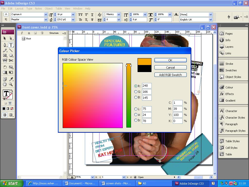
I used the colour tool to make sure I used matching colours, when I wanted to use the same colour again I made sure the numbers on the colour chart were the same, so that I got the exact same colour. This helped me to create a colour code that structured my front covers look. I used mostly yellow, blue, black, white and pink. All of these colours matched up to the colours of the accessories and make up on my model. The colours are mostly feminine when combined together, but they're not overwhelmingly feminine so can attract a variety of girls. The colours are vibrant and youthful which suits my target audience of girls aged 15-19.
Feed back from questionnaire helped me to create this colour scheme, as the people I asked had a similar colour preference of blues, pinks and golds, which I used in my front cover.

Tuesday, 30 March 2010

Front Cover De-Construction


This is my de-construction of the Rollling Stone Magazine, Britney Spears front cover


Sunday, 14 March 2010

Front Cover Deconstructions

One of the front covers I deconstructed was of the Q music magazine, April 2009 front cover of Lily Allen. One of the reasons I chose this specific front cover is because of the sybolism behind the image. The use of panthers, dressign Lily all Black, with her back showing all releates to sensuality and animals, and purposely displays Lily as a sexy, animalistic character. I liked the way she was shown to be characterised differently, and wanted to use the idea of doing something symbolic with my model. I also like the structural arrangement of the front cover; the way the title was placed across the image, the placement of text in the two top corners and bottom of the magazine, giving the front cover a well structured and appealing look.


The typography was also very impressive, the variety between font sizes, and bold, italics, ect. This variety was even included in blocks of text, and the mixture genuinely looked very appealing overall. I felt that if I could find a way of varying my fonts in a way that looked good, similarly to this, then I would try to do so.


The colour coding in this specific front cover was very appealing, the mixture of black, blue, white and red mixed together really well, without looking over complicated, and instead look artistic and interesting. These coloured fonts mixed in with the sexy image of Lily Allen connected togther to make the front cover appealing to the specific target audiece of youngish male men. I wanted to use style these features in my magazine to attract my target audience.


The other front cover I deconstructed was of the Rolling Stone music magazine, with Britney Spears on the front cover. The reason I chose this particular front cover is because I like the black and white, close up image. It was of Britney back in her early days as a popstar, and this edition of the magazine was published shortly after Britneys public breakdown. The symbolism behind the image gave the front cover more of an edge, and made it more appealing.

The fonts were all the same, and either yellow, white or black, which made an attractive colour scheme that could appeal to both genders, which suited the magazine which aims to appeal to both genders.


Magazine Conventions- Double Page Spread

When doing my magazine deconstructing I noticed that the layout was typically, one large picture and a title on one page, with text on the opposite page, or a large picture spread across the two pages with little text. I decided to use a layout with one large picture and title on one side, and a few smaller pictures and a lot of text for the interview on the opposite page. So my magazine shows typical conventions in the layout, but unlike most music magazines, I'm including a variety of other pictures of the music artist; in order to show the variety in the pictures I took, as well as making the page with the text on it more interesting. Which ventures outside of the typical music magazine conventions, giving it an individual twist. I still used conventions such as putting page numbers, the date and magazine title as a footer at the bottom of the page. A lot of interviews in music magazines, highlighted a specific quote from the text, and placed in the middle of the interview, using a larger and bolder font. This way people were given an insight into what topics the interview covered. I included this convention in my double page spread, as I thought it was a good feature to use, and made the page look more professional and realistic.